Designing an wellness app
ROLE
UX/UI DESIGN
TWO UX/UI DESIGNERS
TEAM
TIMELINE
TWO WEEKS

The challenge
For this project at Ironhack, our challenge was to design a new wellness app from scratch. Starting with the research to the prototype. We had a hypothetical client called The Daily Health Conference. The Daily Health Conference is a non-profit organization dedicated to promoting health and wellness through impactful public talks, participatory workshops, and professional training all over the world.
The Daily Health Conference offers an online membership on their website, but the program has been slow to catch up with technology, and as a result, they’ve seen a substantial drop in memberships.
The goal is to rethink how people can adopt and commit to a health-improving routine by creating a new app that demonstrates an innovative approach to wellness, to help The Daily Health Conference regain membership and modernize their image.
Why a fitness app?
I think most of us relate to the feeling of wanting to exercise more (or exercise at all) but not being able to finding the right motivation to do it. It’s hard after sitting at your computer all day to get the motivation to go to the gym and exercise. Even if you do go to the gym, it’s knowing what to do and not feel silly doing it.
We wanted to make one general exercise app that would
motivate people to exercise more.
Competitors analysis
There are at least 86.3 million users of health and fitness apps in the USA alone
and plenty of apps available so
there was no need for us to reinvent the wheel.
We carried out a competitor's analysis by comparing the features we could and couldn’t find in
the most popular fitness apps. The most popular ones were FitBit, NTC and Strava.
Common features within those apps were profile creation, activity log,
data visualization and social media integration.
Features that were not as common were water tracking, online consultations and geolocation.

The NTC app
Survey
We wanted to know why people were using the apps, how and when. Also wanted to know why people didn’t use fitness apps or why they stopped using one. We made a survey and got around 200 answers from both people who had used a fitness app and people who had never used one.
The main insight we got from the survey were:
People use those apps to set goals and track their progress
The main reason people stopped using their fitness app was because it didn’t motivate them
One of the main reasons people didn’t use an fitness app was because they already have their own fitness routine

The focus group
& interviews
60% of the people who answered our survey had used a fitness app or are using a fitness app. Majority of them were between 21 and 30 years old and 90% of them used the app in the gym. Since this group was most likely to use our app we decided to focus on that group and interview them. We needed to get a better understanding of what features are a must have and what features people thought were missing from their app. Why did they choose the app they were using? What about this app motivated them? Why do they keep using it?
Here are some quotes from the interviews:
“I use the app to get ideas for exercises and to keep me engaged.”
“I enter my weights and repetitions and the app tells me what to do based on that. I really like it because I don’t have to think.”
“It would be encouraging to see a summary of my progress.”
Defining the problem
At this state we could start defining the problem. We define by analyzing and identifying issues to be solved.
A common tool in UX Design is to make
a user persona. A user persona is a fictional character which represents behaviors and motivations of users we encounter in our research. Our user persona helped us define the problem our users had.
Fitness enthusiasts with busy schedules need to find a fitness routine that keeps them motivated because they want to maintain an active exercise routine.

Ideating
Once you have a problem to solve you can start ideating solutions. Our idea was to make a fitness app that combines every thing that our users use and like in other fitness apps but also adding features they thought were missing from their app. Features that would improve the user experience.
We wrote down all of the features we could think of and all the ideas our users had mentioned. After that we had a lot of features and ideas so to help us prioritize we used another tool called MoSCoW method.
MoSCoW stands for
Must have, Should have, Could have and Would like but won’t get.
Here are some of our Must have:
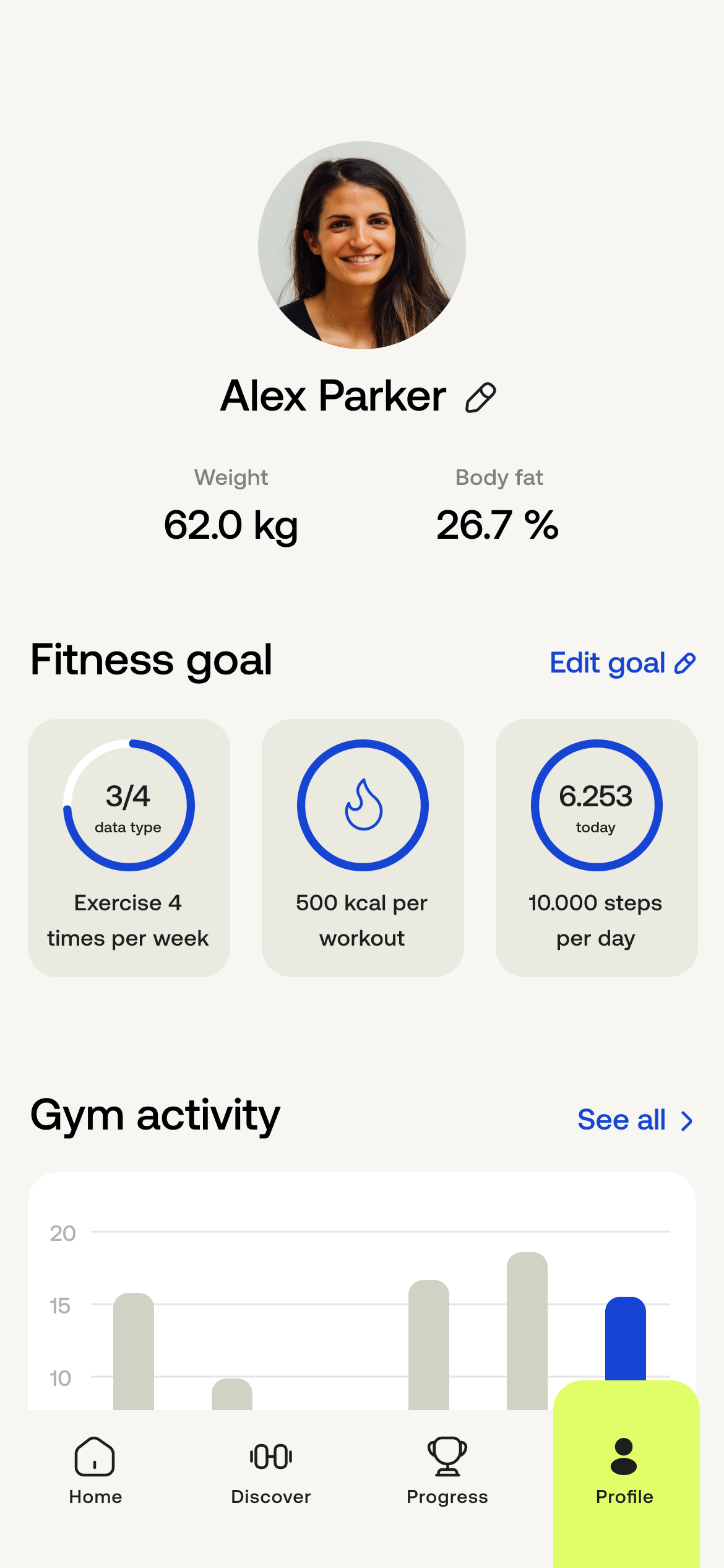
Log your info and activity for more personalized program
Have a “change my goal” option in the profile
Be able to make your own exercise with guidance or tips from the app
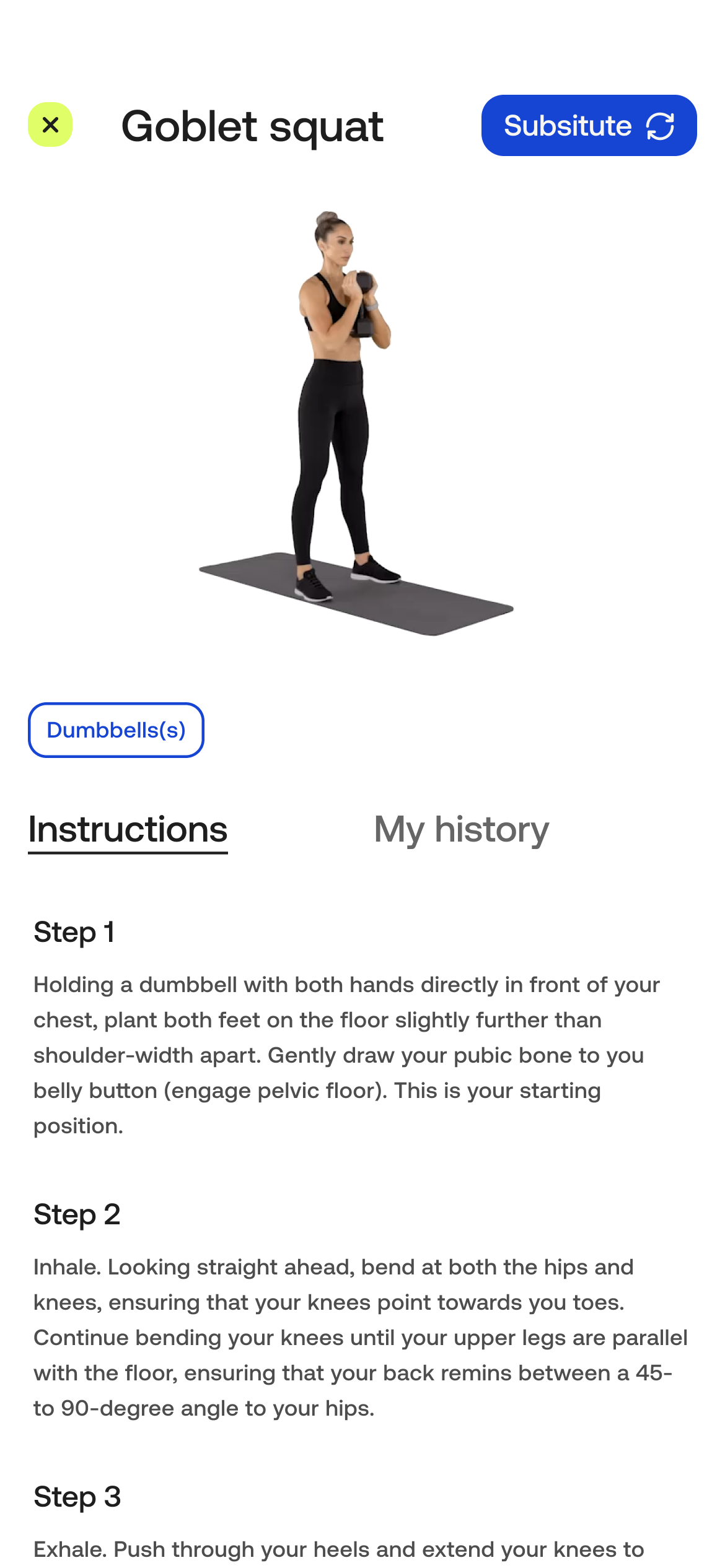
Substitute exercises inside of a program
Be able to list what equipments you have available at the moment
Give the option to share the session summary in Social Media

User flow
User flow helps us to see the big picture and understand how the user will navigate through the app and it’s a really important step before starting the visual design of the app. Our user flow follows the user from the moment the user opens the app, selects the exercise of his choice, follows through the exercise and to the workout summary at the end of the exercise. The user then goes to the profile at the end of the flow.

Our user flow
Sketching
& testing
We made our first digital sketch of the app and tested it with our users. It’s important to test with the user before so we can collect feedback, iterate and define the layout and the elements better on the flow and the functionality of the app without the visual design getting in the way and distracting the user. We got very valuable insight like the order of the cards in the home page, missing information about the length of the workout and confirmation message about user decision.

Main attributes
& moodboard
We defined the mood of the app with four main attributes:
Activity
Determination
Motivation
Enthusiasm
From that we made a moodboard.

Style guide
To give the message of trust and confidence we chose electric blue as our primary color. For an exciting and motivating look and feel we added the neon yellow as accent color.
For typography we chose Aeonik Pro, a modern sans-serif that we thought fitted the fitness world but not overwhelming because we already had really strong colors for the app.
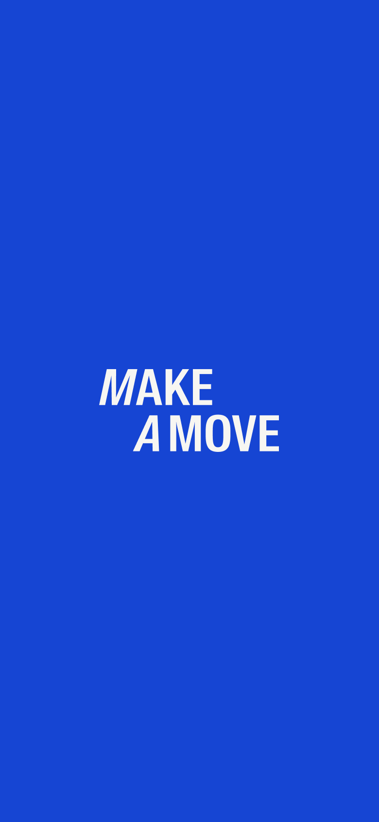
Then we designed a name and logo fitted for the app. Straightforward message in a strong typography, with some added details.

Prototype
Here you can see a video were we go through our prototype.
iPad version
We also made an iPad version. iPad version for a gym app you may ask? Yeah in our interview some said they prefer to use their iPad at the gym rather than their phone.


-
![]()
-
![]()
Home page
-
![]()
Exercise overview
-
![]()
Intructions of selected exercise
-
![]()
Your history
-
![]()
Exercise started
-
![]()
Summary page
-
![]()
Profile